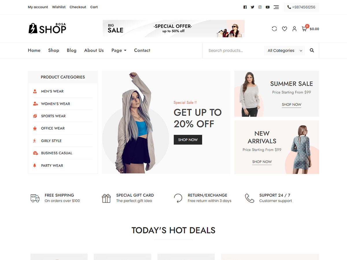
Visit bigbobnetwork.com/BigMedia/. This theme is designed to give your users easy access to navigation controls and provides strict styling standards so that you can focus on pushing out your content. From small menus to large menus to scroll arrows to menus that can be extended into the sidebar and collapsed into the pop out menu for mobile navigation, the Big Scene theme will allow you to create a site where your users will never get lost and will always be able to find what they’re looking for. This theme features maximizing the use of images and videos as a way to give your site a unique look. It does this by creating a layout that adapts well to a variety of different header videos (including YouTube videos) and header images as well as background images and videos. Everything is designed with mobile compatibility in mind. Users may find that they can create a unique look by just uploading a video and a few images. It includes a sticky sidebar and multiple sticky navbar options and a slide panel menu for mobile browsers as well as multiple Gutenberg block extensions, and it has the ability to set menus and widgets in three different locations. Whether you’re interested in black, white, yellow, bubble pink, blood red, or puke green, the Big Scene theme provides multiple color palettes to get your site to match your message. In addition, it provides opacity range bars, so your background images don’t go to waste, but your text readability won’t be compromised. It also gives you access to the Google fonts free online library, so you can access the coolest classic fonts or the newest and latest hits. To read a detailed list of features and instructions, please visit bigbobnetwork.com/BigMedia/.
Big Scene


